I’m someone who gets a lot of GitHub notifications – this week had >100 individual notifications.
The problem
The “new” GitHub Notifications UI1 was based on Octobox. It was a step in the right direction to help with my notification “workload”, although I recognise that it was not perceived as such by many others.
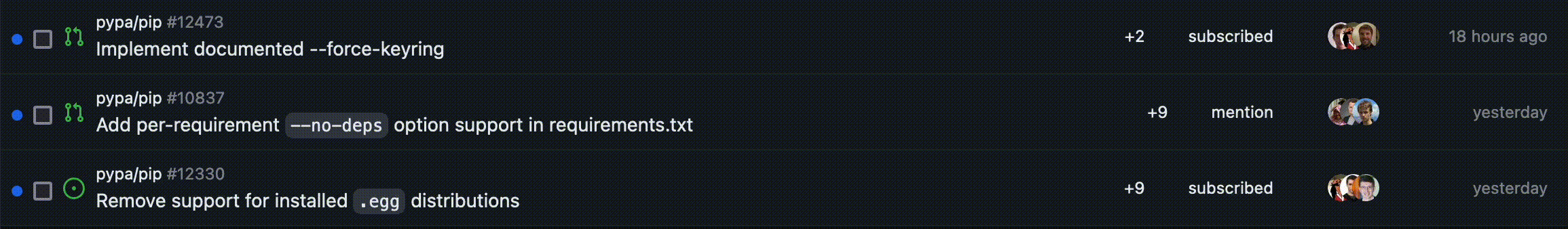
That said, they copied over the exact same design issue I had with Octobox: the action buttons are on the completely opposite side from where my attention is.

I am going to scan and read the content of the notification, which is left aligned and very close to the left edge. All the action buttons are on the right edge. This makes it difficult when trying to triage notifications, especially when I’m trying to do so in bulk where stuff like “oh, this is not gonna need my attention” requires me to drag my cursor over to the other side of the page.
If there’s a keyboard shortcut for this, I don’t know it and I don’t want to learn it anyway. I want to be able to use the mouse to do what I need here because that’s how I use a computer.
The solution
I wrote a blurb of CSS to remove this annoyance.

It moves the action buttons toward the left side, so that I can quickly triage notifications without having to move my cursor across the screen. It also moves the text describing the content that the notification is for (repository and notification subject) to accommodate for the buttons.
If you know me, you know that I will animate moving text to different locations. In the end, this was fairly easy to achieve in this case.
I’ve been using this for quite a few months now.
The stylesheet
Recently, while screen sharing with a friend, they asked me about my GitHub notifications doing this really cool thing. That’s when I realised that I had completely forgotten that this was something I had been injecting into the page. I shared it with them and realised that some other people might find this useful too.
If you also find this change to be an improvement, the CSS blurb that needs to be injected is provided below. You can add this via Refined GitHub’s preferences page or use a more generic extension like Stylus to inject this into the GitHub Notifications page.
.notification-list-item-actions {
  right: unset !important;
  left: 4rem !important;
  padding: 0 8px;
}

.notifications-list-item:hover .note.notification-list-item-hide-on-hover {
  visibility: visible !important;
}

.notifications-list-item .notification-list-item-link [id^="notification"] {
  margin-left: 0;
  transition: margin-left 100ms cubic-bezier(0, 0.8, 0.2, 1);
}
.notifications-list-item:hover
  .notification-list-item-link
  [id^="notification"] {
  margin-left: 8rem;
}

.notification-list-item-link > :nth-child(1) {
  align-self: unset !important;
}
.notifications-list-item
  > div:nth-child(1)
  > div:nth-child(1)
  > div:nth-child(1) {
  align-self: unset !important;
}